10 key tips for lighting and look development
Cosku Turhan’s 2012 showreel. Below, the Sony Pictures Imageworks Senior Lead Technical Director reveals 10 expert tips for realistic lighting and look development work, drawing examples from the shots above.
Photorealism is both my professional speciality and my personal passion. I like to observe the nuances of natural phenomena so that I can trick an audience into forgetting that what they are watching is CG.
In simple terms, what we do is make believe, and because we don’t have the tools or computing power to reproduce all of the detail present in nature, we have come up with certain tricks to achieve a similar effect.
Here are a few tips technical directors like me use every day to overcome the curse of the ‘CG look’ and to streamline the process of lighting and look development for characters and environments.
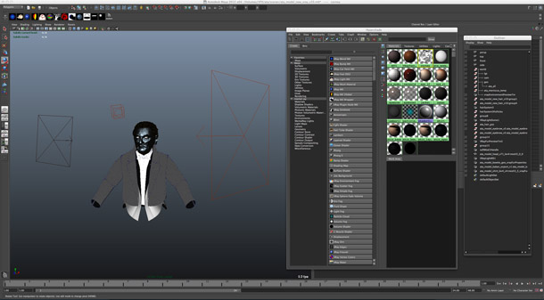
A simple look development environment. Keep look dev and final shot lighting separate.
1. Keep the look dev and lighting separate
Don’t look dev your character in the shot: it’s too distracting. If you don’t have reference footage shot on a practical lighting stage from which you can extract the lighting information, create a neutral light rig with a key, rim, fill (all white) and a sky dome (like a sky HDRI). Dial your materials and texture corrections for all your characters into this rig so that you can ensure consistency between them. Use the rig for all your look dev work – or, if you have time, create different rigs to test how your characters hold up in extreme lighting situations.
Before moving into colour, test models with a simple gray material applied to refine bump and displacement.
2. Test your displacement with gray-shaded materials
Good displacement and bump maps will get you a long way towards achieving realistic materials. But it can be hard to evaluate their effect when viewing a model which has diffuse and specular textures applied – so create overrides on your materials (or render modes in Maya) to turn off diffuse roughness and spec maps. You should be left with a plastic-looking grey material which will help you debug all your displacement issues.
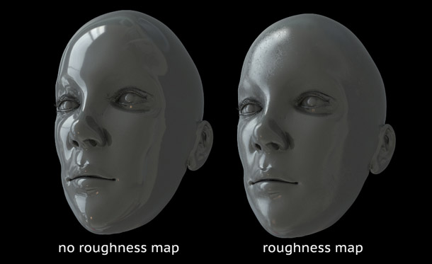
No real surface is completely smooth. Use roughness maps to simulate microscopic natural irregularities.
3. Use spec and roughness maps to simulate surface irregularities
In real life, even the smoothest of surfaces – be it a car paint or a mirror – will exhibit variations in the way it reflects light. Things like fingerprints, the direction in which the surface was wiped and slight fluctuations in the coating will cause surface irregularities that can be simulated with roughness maps.
Similarly, bear in mind that objects don’t always reflect the same amount of light in every direction. For example, when dirt accumulates in creases on a surface, it reduces their reflectivity. This phenomenon can be reproduced with spec maps. Variations in spec maps is the key to creating truly photorealistic materials.

Even if the final render will have a limited tonal range, always create color maps at full dynamic range.
4. Always paint non-color maps with the widest dynamic range
Non-color maps such as spec, roughness and even bump should be painted with the highest dynamic range possible (so whites have a value of 1, and blacks of 0). Even if this seems too extreme for the effect you’re searching for, if you limit the dynamic range from the start, once you start pushing these maps around in the material, you’ll get clamping and banding. If a map has an adequate dynamic range, you can always compress or expand it to give you the desired range in the material later on.
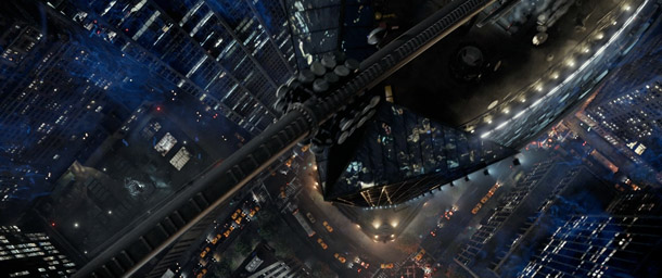
Using linear color space throughout your pipeline takes getting used to, but produces superior results.
5. Use linear color space all the way!
Color space is a hot topic in the industry, and at present, the way to go is linear all the way. [If you’re new to linear workflow, Greyscale Gorilla has a good overview, including links to more detailed articles – CGC.]
Always export your maps in linear color space, and work in linear mode in your renderer. It’s also good practice to export your displacement and bump maps with a depth of 16 bits or more. Then render your images in linear format (as EXRs or linear TIFFs, for example) with a minimum of 16 bits so you have maximum flexibility in comp. Compositing packages like Nuke and Flame work in linear space, so if you work this way, you’re linear from start to finish, giving you the freedom to output in any format or bit depth you want.
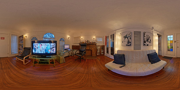
One of HDR Labs‘ free sIBLs. Use textures like this to break up the regular spec patterns of CG lights.
6. Use textures on your lights, with falloff and no sharp shadows
When you are lighting a scene, always use textures on your CG lights to break up the even specular pattern. You can find some free maps online (for example, HDR Labs’ sIBL archive) to plug into your digital versions.
Another thing that sounds obvious but always creeps up in amateur CG renders is sharp shadows. In reality, light sources are not single points in space, and even light rays from those that are near-infinitely distant – such as the sun – are refracted by the atmosphere. Therefore, always tweak raytraced shadows on your spot and point lights so they aren’t perfectly sharp. Also, always use realistic decay in your lights. No decay, perfect specular patterns and perfectly sharp shadows are instant giveaways of CG renders.
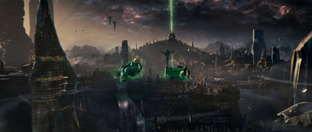
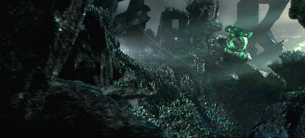
Simplicity works: outdoor shots on Green Lantern use only a sky dome and single directional light.
7. Simplicity is key in big environments
Unless you are in a fantastical alien environment, outdoor scenes are usually lit by the sun and the sky alone. So use only a directional light and a sky dome to achieve that natural look. Highlights are usually defined by the color of the sun, and the shadows will usually be influenced by the color of the sky. To get the most out of this simple but effective lighting scenario, always use global illumination. GI is the bread and butter of photorealism.
For the large shots of the alien planet in Green Lantern, I used only a sky dome that was color corrected and a directional light. The color difference in the sky dome was enough to give the resulting renders that alien feel.
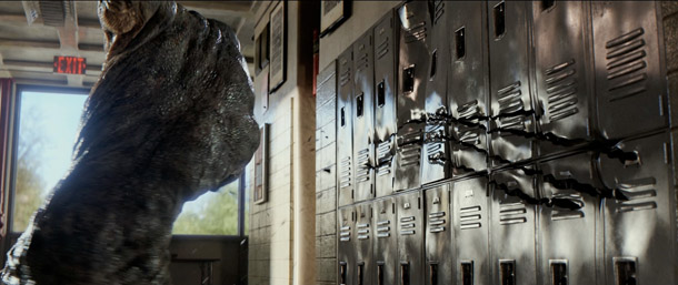
Layered materials lend realism to the CG walls in this shot from The Amazing Spider-Man.
8. Know when to use layered materials
As much as people fear them, layered materials are super-useful in getting certain looks. Things like car paint, polished wood floors and lacquered surfaces consist of a base coat covered with a clear coat that gives them their shiny appearance. Even skin can be simulated in this way.
In most cases, a layered material with a rougher base material that defines the color and base spec under a fully refractive shinier clear-coat material with spec alone will give you great results. (Note: when you are using layered materials, make sure that your specular values for the two layers add up to 1 – for example, 0.3 for the base coat and 0.7 for the clear coat.) On The Amazing Spider-Man, we used layered materials on all the walls and floors in the high school to achieve a polished look.
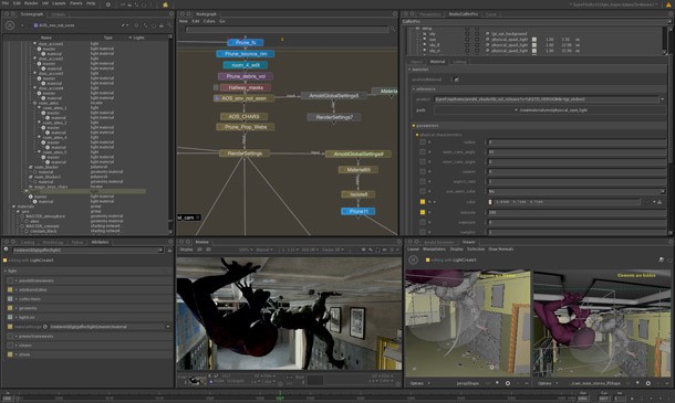
Relighting in Katana. Even if you don’t use specialist relighting tools, render lighting elements separately.
9. Render out lighting elements separately
Even though lighters want their renders to be perfect out of the box, there are always things that need tweaking in the comp. Things like changing the light balance, adjusting specularity – or just getting good mattes – are only possible if you render out the lighting elements as separate passes.
At Imageworks, we always render spec, diffuse, separate lights, mattes, Z-depth, GI, point and normal passes by default. These are also great for debugging shots: for example, identifying what an individual light is doing, or determining the relative contributions of indirect and direct specularity to a particular highlight.
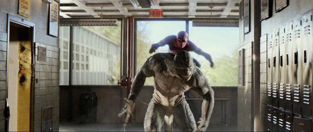
Photographic reference was the key to achieving the realistic-looking posters in this shot from Spider-Man.
10. And remember: use reference material!
I can’t stress this enough. Even if you’ve been dialling materials over and over for years, you still always miss out something that makes the result look absolutely real. You can only pick up these subtle details by comparing test renders to real-life reference material.
For example, on Spider-Man, we had to place hand-made posters along a CG hallway. It sounded a simple job – but it proved to have so many intricacies (the difference in shininess between the marker drawings and the surrounding paper, the variations at the corners of the posters, and so on) that we’d never have been able to achieve a good result if we hadn’t had good photographic reference.
 Cosku Turhan is currently Senior Lead Technical Director at Sony Pictures Imageworks, where he has led teams of artists on Green Lantern, The Amazing Spider-Man and Sam Raimi’s upcoming Oz: The Great and Powerful. A graduate of Bilkent University and USC, he also worked at Vanguard Animation as a character modeller and rigger.
