10 essential tips to improve your CG layout work
Create more coherent, compelling compositions for 3D animations, storyboards and animatics with Sony Pictures Imageworks’ senior layout artist Arem Kim’s 10 essential tips for composing better CG layouts.
Layout is the first step in the production pipeline, where you decide what will be shown on the screen. If done well, the audience will not notice the camera’s presence. However, when done poorly, the viewers will be distracted without knowing why. Bad camera planning distracts attention from the story.
In this article, we will run through some rules for creating better camera layouts. The early tips introduce fundamental concepts, and are common to storyboarding, creating animatics and live-action film editing, while the later tips are more specific to layout work for 3D animation.
1. Use camera height to convey the power of a character
When the camera’s point of view is above eye height, looking down, the viewer feels dominant over the subject. When we use a high camera angle on a character, he or she looks powerless or less important.
A low-angle shot, beneath eye level, makes a character look dominant and menacing. Cutting between low and high angles can help to describe the power relationship between two characters.
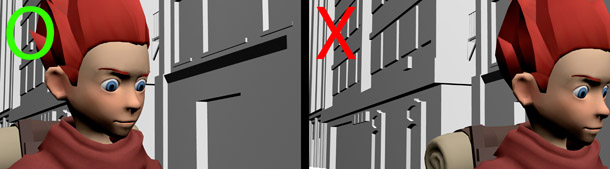
2. Use camera alignment to control how viewers relate to a character
A POV shot is subjective. When the camera is placed on-axis with the character, the viewer will treat it as a first-person point of view. In a conversation scene, cutting between POV shots can enhance the emotional connection between two characters or the intensity of the conversation.
A profile shot is objective. When the camera is placed perpendicular to the characters, the viewer will treat it as a third-person point of view: not directly engaged in the conversation, but viewing it from a distance.
Using both types of shot together makes it possible to play with visual intensity as a conversation progress.
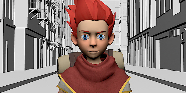
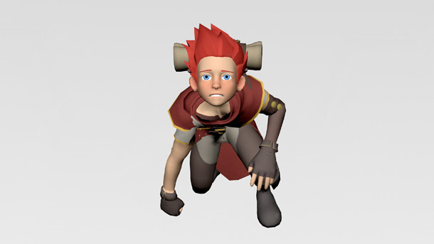
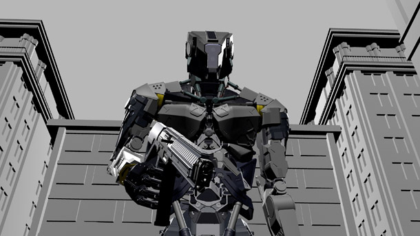
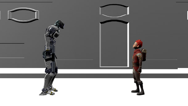
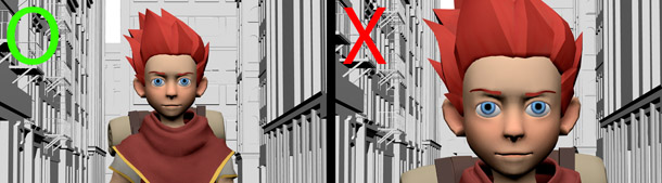
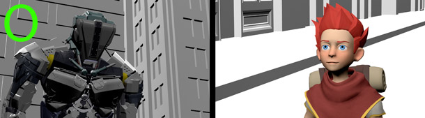
3. Use long lenses to bring characters together
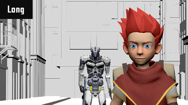
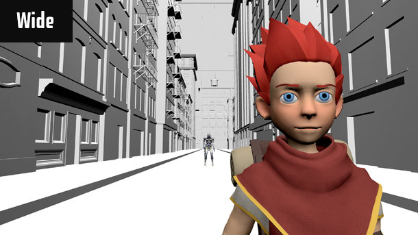
The camera lens you choose determines the viewer’s perception of space. A wide lens (one with a focal length under 35mm) compresses space; a long lens (one with a focal length over 70mm) expands it.
This determines the viewer’s perception of the relationship between a character and their environment. In the images above, the characters are positioned identically with the scene, but when shot with a long lens – in this case, a 150mm lens – the robot looks like it is standing just behind the boy.
Another notable difference is the depth of field. A wide lens has a shallow focus compared to a long lens, which can be used effectively when it is important to separate the character from the background.
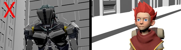
4. Dos and don’ts for framing characters
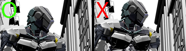
Leave some space above a character’s head when framing a shot. Conventionally, you should leave the least amount of space above the head necessary for the character not to look crammed against the top of the frame. The more headroom you have, the smaller the character will look. Once the head is touching the top of the frame, it is better to go tighter on the character’s face. Cutting off the forehead looks normal.
If a character is looking to the side, they need space in front of them to accommodate their gaze. The more in profile they are, the more ‘nose room’ is needed. This is also called ‘lead room’ or ‘looking room’.
When framing a close-up, it is better not to situate the edge of the frame through the character’s neck: the resulting image can be perceived as a decapitated head.
A similar uncomfortable illusion happens when an edge of the frame passes through one or more of the characters’ joints: knees, elbows, ankles and so on. It feels like the person is missing something from their body. To avoid the problem, either go wider with the camera or crop in tighter.
5. Follow the 180-degree rule
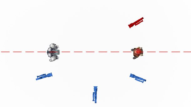
Correct camera placement prevents the audience from getting confused about where they are in a scene, and in which direction they are looking or moving. Here is an overhead view of two characters looking at each other. Let’s draw an imaginary line between them.
If you position all of the shot cameras on one side of the line, the camera views will cut together seamlessly.
However, if camera placement crosses the line from one shot to the next, continuity will be broken: characters will jump from one side of the screen to the other, and will not seem to be looking at one another.
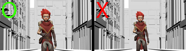
6. Follow the 20% and 30-degree rules for consecutive shots
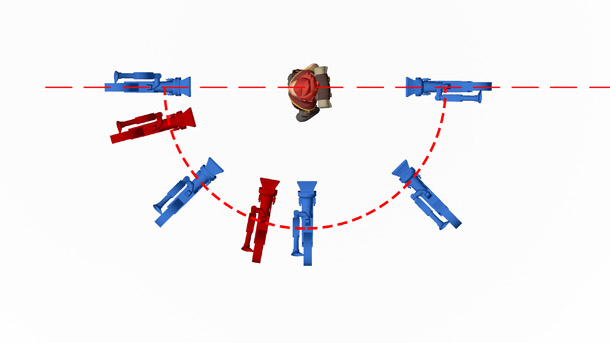
Editing together two camera views with a similar camera angle or field of view creates a jump cut: the change in continuity becomes jolting, making the audience aware that the camera has just changed. This is not recommended in film-making unless done for deliberate effect.
To avoid a jump cut, follow the 20% and 30-degree rules: there must be at least a 20% change in the size of the subject and a 30-degree shift in angle when cutting between cameras. In the diagram above, cutting between two blue cameras would look natural; cutting between a blue and a red would create a jump cut.
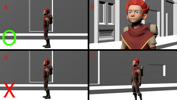
For example, image A and image B are different enough in size and camera angle for a cut to look natural, but image A and image C are too similar. When you edit A and C together, the result will be a jump cut.
For the same reason, it is not advisable to use the same lens from one shot to the next.
7. Make the character lead the camera movement
So far, we discussed the basic rules of cinematography. Now let’s talk about creating virtual cameras in 3D software. The basic rules still apply in the virtual world, but there are also other things to consider.
One mistake I see in a lot of student reels is that the camera begins to move before the character it is following, as if it predicted the action in advance.
In real life, a camera operator can’t predict exactly when the actor will move, so animation looks more natural when the camera movement is delayed by a few frames.
It is important to remember that a real camera has weight, especially big film cameras. When the operator pans the camera, there is a slight lag at the beginning of the movement. If you animate the camera without thinking about its weight, its movement will either look mechanical or as if it defies gravity.
8. Push in to the eyes
When the camera is pushed in during a shot, it is best to go to the character’s eyes. This keeps the audience focused on the character’s feelings.
If the push-in point is the mouth or some other body part, the audience will naturally switch focus to that part, breaking their concentration.
9. Group your cameras to keep them organised
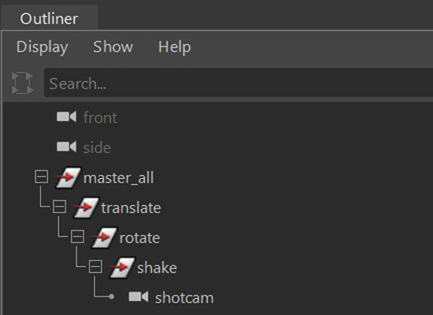
When a camera has to move in more than one axis, it helps to group camera properties in your 3D software. In general, a group should include the master control, translate, rotation, shake, and the camera itself. Each one has a defined role. For example, I only key translate nodes at the translate level of the hierarchy.
10. Set the rotation axis before moving the camera
When the camera moves on the diagonal instead of only moving in the X or Z axis, rotating the camera to match the direction of travel helps to simplify the animation. This is because you only need to manage one axis instead of two in the Graph Editor.
In contrast, not rotating the camera before moving it is more complex, and the result looks less natural.
 About the author: Arem Kim is senior layout artist at Sony Pictures Imageworks, having previously worked in layout or previs at studios including Animal Logic and The Third Floor, and for cloud animation platform Nimble Collective, working on movies including Smallfoot, The Lego Ninjago Movie and Power Rangers. See more of Arem Kim’s work on her website.