The Art of Dante’s Inferno
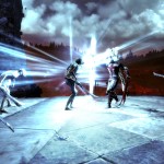
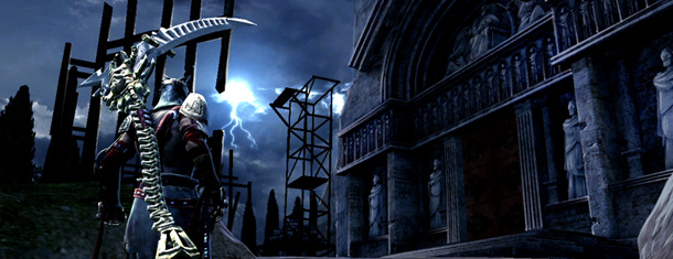 Dante’s Inferno is a video game inspired by the epic “Divina Commedia” (Divine Comedy) poem written by Dante Allighieri in the 1300’s. Italian mercenary Dante returns home from war to find that his beloved Beatrice has been murdered, and her soul pulled down into Hell by a dark force. He gives chase and subsequently fights through the nine circles of Hell to bring her back.
We recently got to sit down with Richard Larm, Lead Environment Artist and Ash Huang, Art Director for Dante’s Inferno at Visceral Studios, about the “hellacious” art and design for the game.
Could you talk about the design process for the development of the in-game enemies?
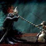
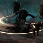
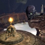
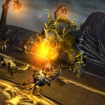
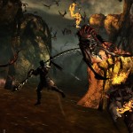
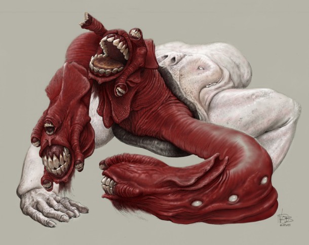 For some of the “big guy” characters, especially for the upper circles which are a little bit more fantastical in nature, we started on those early because they were a little more “out there” in terms of the circles. The character and creature designs started early on with Wayne Barlowe. We got together with Wayne in the pre-production process. We had ideas of what the characters were going to look like and he had some ideas so we threw them all into a mix. The foundation for came from the poem.
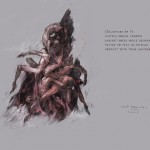
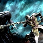
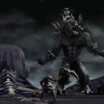
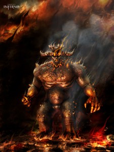
A good case study of that would be Cerberus. We knew traditionally that Cerberus was represented as a three-headed wolf, but we knew for Inferno we wanted to take things and twist them around a little bit in a horrific surreal kind of way. Wayne is a really good artist to approach for that because he has a way of twisting things in unusual ways.
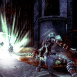
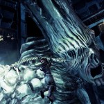
The other thing that was important for all our creature designs, especially the bosses and Hell in general, was that we had to retain an aesthetic kick-back to some sense of humanity. You’ll notice in a lot of our creature designs that you could still see a person in there, and a lot of the time, the creatures are really about taking whatever sins they manifest and turning that into a physical attribute in a horrific, twisted and surreal way.
What about the character design of the main character Dante?
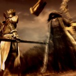
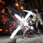
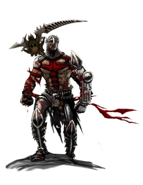 For Dante, that took the entire development process in terms of pre-production. He was in the pipe for three months, going back and forth trying to figure out what he would look like. It was very important to have a strong call back to the period, with the correct idea that he was a crusader. We did not want to get a Lord of the Rings look either.
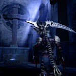
Two big things about him, one was the myth, and the treatment of the cross and the tapestry, which was a vehicle for telling a story about him. He basically wears his sins. That came from back in the day when the crusaders would get a small little fabric cross to pin to their tunic. The idea for wearing the cross as a metaphor extended out as being something much more visible. At the same time it’s sewn into him, which suggests some kind of pain but also binds his arms. It’s the idea of him wearing the cross as he wears his sins but at the same time he is bound by the cross. That became a big visual treatment to his design.
The other thing was looking at traditional depictions of Dante. A lot of times you see pictures of him wearing a laurel on his head. So what we did was push that out as to something that is akin to a piece of armor. If you look at it, it is a pretty painful looking device, recalling the idea of the laurel of thorns. It still has a laurel feel about it but if he were to head butt you with that, it would really hurt!
When we were designing the armor, the expression that came out was that he had to be a warrior. He can’t be a passive poet. We knew we had to go there and if he was a warrior he had to be really adept at what he did. You think about soldiers or warriors that are really good at what they did, they probably customized their armor. So that’s where we took a little bit of liberty with that, and imagined where he would change his armor.
One of the problems, it would seem based on this is that there is a lot of art already in existence for Dante’s Inferno. Especially, from the classical story with Gustave Dore’s work. Did that play a big influence on your design process, or did you try to work away from that?
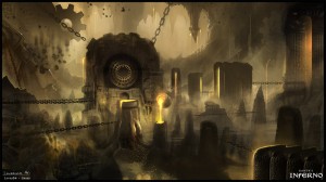 I would say that we looked at a lot of work that was already out there and it depended on what it was. For example Rodin was a really big influence on what we did simply because there was a certain kind of effect – what we call a “visual effect” to his art – and that was very inspirational. In a cases like that, it was an influencing factor but we did not use it directly. We looked at what had been done in precedent only as a reference.
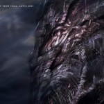
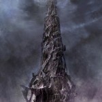
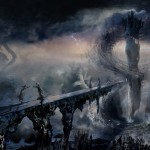
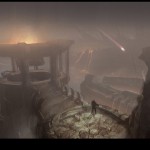
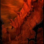
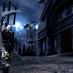
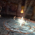
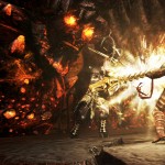
There is also an artist name Zdzislaw Beksinski. He used to be an architect, and he has this way of painting the world in this incredible sense of a “time beyond time”. It’s so old, but at the same time it also has this great since of decay. That was very inspirational for the kind of world we wanted to paint in Hell in because Hell is a place that predates time. We wanted to come up with a “visual culture” of what Hell might be like. We knew it had to be ancient, and the influences come from everywhere really.
How much back and forth did the level designers and artist have in order to work with each other on DI?
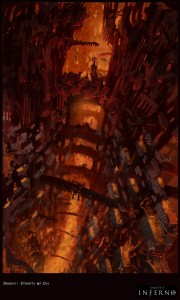
Mike Cheng had the vision of the levels, the pacing and the big moments of combat that were fed by story elements. Before Mike started designing the levels, Jonathan Knight, Mike and I would sit in a room and talk about what the treatment had been in the script. That would play against the backdrop of what was going on in the poem in context of that particular circle, remembering important anchor points from the poem.
Then Mike would begin a high level treatment of the overall pacing of the entire level. There was a lot of back and forth where he would occasionally come over to the art room and we would throw ideas back and forth. We would influence each other. For example, he would have an idea of how a game play piece might work. We would ask, “What about if we tried this from an art perspective?” Then we would try to navigate that so that the game play would still work.
At the end of the day, we took the common ground that game play rules, so Mike would have the final say on whether or not whatever we were throwing out was appropriate to what he needs to achieve in terms of the game play.
Generally that’s how it worked. When he had a high level pass on it and we had a chance to move back and forth during that process to review it, it would be broken up and individual leads could start to drill down, distil it, add to it, embellish and add more meat to the framework of what he had laid out. At that point, they were literally building light box bases and had the hero running through un-textured white box areas. We’d lock down the game pacing and then from there Mike would run through it. Ash and myself (Richard) would ask about what we could do with it considering the technical limitations.
Once we felt good about these levels, we would take it to the art team and have them draw over screen grabs of the white box spaces and do paint-overs. Then it would come back to environment art and we would fill them out.
What are some other challenges you had to face while designing Dante’s Inferno?
 One of the biggest things from an art and development perspective was that we had decided from the start that we would make a 60 FPS game. That decision from the get-go really begins to sculpt the sand box in which you can play in, which is much smaller than a 30 FPS game. That was a big challenge in the beginning; with figuring out with all the creatures, environment and characters, how are we going to make it look competitive with what’s already out there that running at 30 FPS and you only have half the bandwidth. We came up with a lot of different creative solutions from a technical perspective. This has been the only game I have worked on with this kind of collaboration between the artists, level designers, visual effects and animators.
Everybody had a limited budget to work with. 60 FPS breaks down to 16.66 milliseconds to draw a frame and inside of that each person gets an “allotment”. We had to be very aware of what was going in the levels. For example, if Mike needed eight non-player characters to attack Dante, that meant that animation and the effects were going to need a lot of room. So for that, Rich would have to scale back on, or be very clever about how to make use of his geometry budgets in order to put this together in a way that it still looked good. But the artist had to be very aware of any space away from the gameplay perspective so they could build it in an appropriate manner.
So in a sense you really had to be aware of the size and couldn’t go overboard with the textures or image maps size.
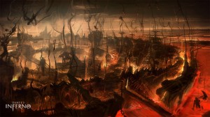
There are dozens of things that add to the entire accumulation of things. We were constantly juggling a dozen different technical hurdles. You can optimize one or axe another and all those things will lead you over budget. We had really good metering tools that we could see on screen, so we could see what the performance was at any given frame. It would let us know immediately if what we did would push it over or was cost effective.
How long did the art team have to conceptualize Dante’s Inferno?
Our process wasn’t like, “Our concept artists start a process and then it would end and then another phase of the production would begin”. Concepts were moving alongside, especially when we got into the environments concepts. They were leading out ahead of the environment guys by a bit, but the process ran through the entire length of the project. Up until the final two months we kind of petered out on the concepts because we had figured out what everything had to look like. In total time they were probably on the project at least eighteen months.
CG Channel thanks Richard Larm, Ash Huang, Electronic Arts and Visceral Games for enabling us to do this interview. For more information about Dante’s Inferno, check out the website at www.dantesinferno.com.
Related Links
Dante’s Inferno Official Website

